The letter 'F'.
For Michelle Duckworth's class on children's bookin!
Wednesday, September 1, 2010
Tuesday, August 31, 2010
Illustration Post #3
Describe your typical creative process, from getting an assignment to finished piece.
I usually go first into thumbnailing mode first off. Not a set number of them but getting my initial ideas on paper first and then when they're out visually trying to mess with them to refine it more. From there I go to the internet and get some relevant reference photography or textures, for textures either something logical to what I'm drawing or something way off for just a textural effect.
After I've decided on a composition/idea, I do a light pencil sketch at or near print size to get the composition solidified. I either then ink the drawing then scan or straight off scan and do digital inks.
All the tones/coloring is digital in Photoshop.
Describe what you think your creative process should be like.
Ideally, I should expound on ideas and get more elaborate/risky with ideas, if they worked they'd pay off well visually in the end.
Research and describe a professional creator's creative process (this person need not be a visual artist. Dancers, writers, film directors, and so on, may have equally illuminating views on creation).
...
Illustration Post #2
Of the artwork that you have done, what is your personal favorite? Why do you like it?
So far...
What piece do other people like most? Do you agree? Why do you think they like it?
Well, I'm not really sure lately but people used to like this one a lot.
What piece surprised you the most?
Probably this one. It started out so bad in colors and everything but by the end really turned around I think.
Choose five doodles or sketches that you like as much as any of your finished pieces.
I'll get back to this one.
Illustration Post #1
What media do you like workin in? List them.
- Pencil
- Ink
- Digital
What media do you hate working in? Why?
- Paint, I tend to hate it probably because I have less control than with digital (I've spoiled myself with the ease of digital use). Getting one color then having to remember how exactly I got that color was a problem for me before. There was a part I did like about it though.
- Cut Paper, I don't hate the aesthetic I just hate working in it.
What media would you like to try, but haven't?
- Screen printing for it's graphic nature
- Woodcut, haven't tried it for illustrative purposes
List three non-Illustration classes that have influenced you and / or your work positively. Explain.
- Drawing Composition, Really got me to start looking at composition more analytically and to structure imagery better.
- Design Systems I, Notorius class but it improved my design sensibilities and craft noticeably.
How has the work of your peers influenced you and your work?
Seeing everyone's work progress over the past years and the varying range of styles and approaches has really made me want to do the best I can to even just keep up with everybody.
What sort of subject matter do you like to create work about?
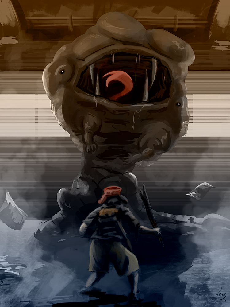
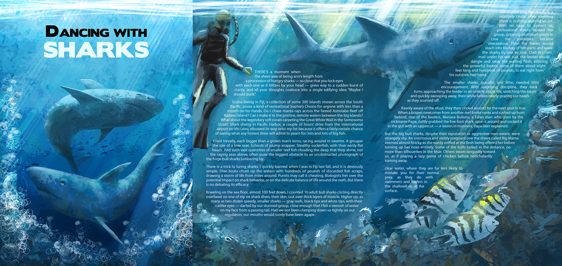
I like to create art about fantastical things either in fantastical settings but a lot of times in seemingly normal surroundings.
What sort of subject matter do you like to read about?
Strange things that have actually happened. In stories I read mostly fantasy as well.
What kind of music do you like? Why?
I try to find as much different kinds of music to listen to. Mostly I listen to variations of Indie Rock when it's down to art making. Lately I've been getting into some pre 1950s Blues though.
I like those types of music because most of the time they're not too busy to distract my mind but still make me feel better because it's music.
What non-art related interest/hobbies/skills do you have?
I like video games and everything that goes into making them. I build computers from time to time, and skateboard (every once in a while). 3D Modeling is something I can do pretty well also (but that's sorta art related).
What is something that you like that nobody else likes?
Probably the Scissor Sisters.
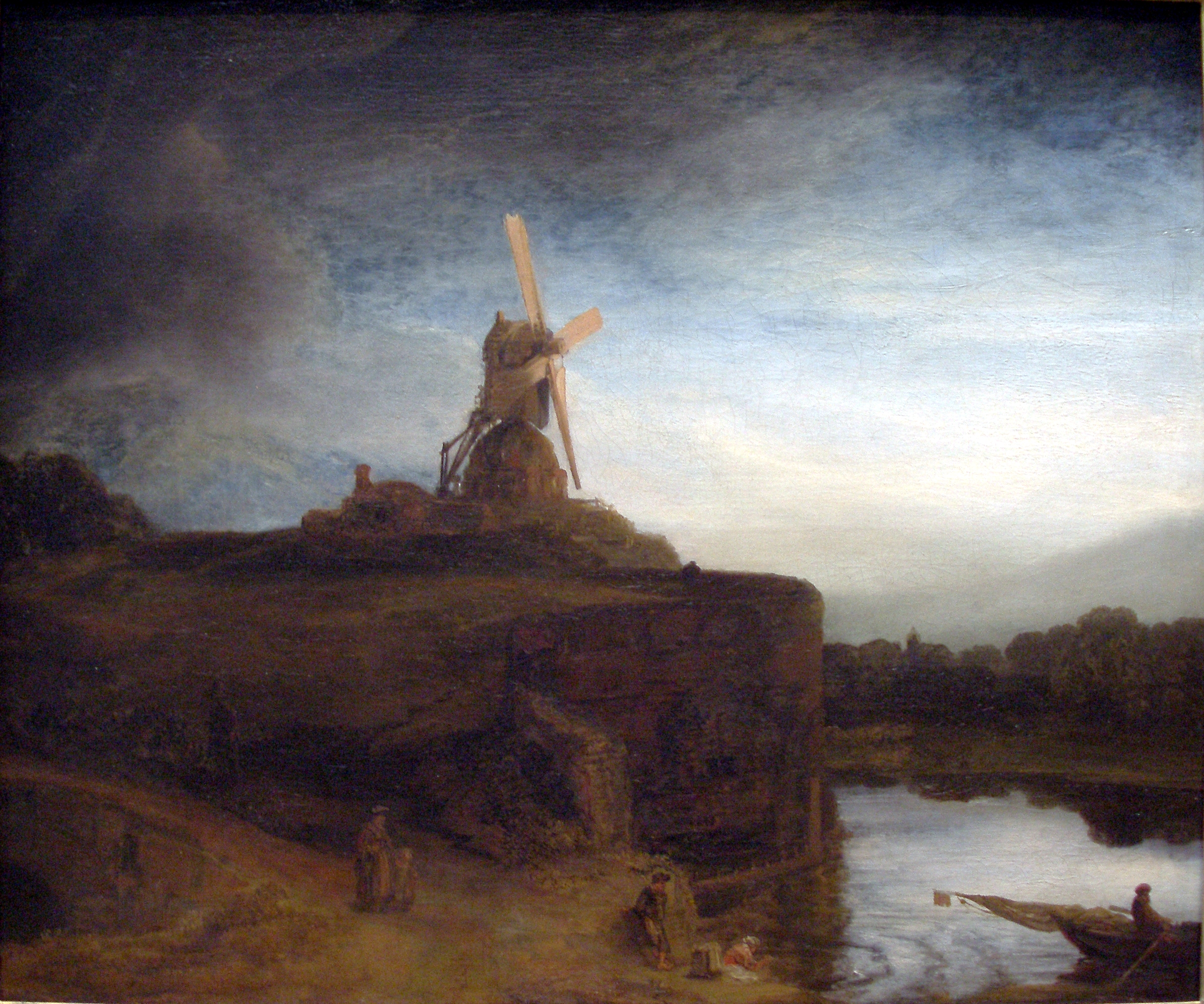
If you had the run of the world's museums, what three works of original art would you like to own?
Rembrandt's The Mill
Jose Emroca Flores The M.K.
Maxfield Parrish - Mary, Mary, Quite Contrary
Saturday, August 28, 2010
Wednesday, April 1, 2009
Critique - Jessica Biggs and Andrew Lebowitz
Jessica Biggs
Overall a pretty atypical web layout. The content is spread through pretty designer-ly areas, perhaps too much attention to graphic design and not enough to the ideas of web design.
Not to say this site template is bad in any way. The tiling background is a nice touch that really sets the stage for all the content. It's certainly not hard to read either. Good contrast ratio making the text very legible and easy to read. So far I'm interested in seeing more work from this designer.
The couple of things I may take issue with are the fixed elements that move with the window borders and the placement of the lower left imagery and "scrolling" content.
The fixed elements are definitely a nice touch but I found when viewing the site maximized (as I know many people do as well) it seemed vast and empty. I was wanting something to fill the space more. This second party could be related: I thought the "scrolling" content where the greeting and the vertical images are while very appealing isn't using its full potential. It may just be an ultimate Graphic Designer decision to have the larger text there at about halfway down the page, but I feel either it could be scooted up to reveal more content and then having less scrolling going on or not displaying the vertical images there at all (or in a different manner, horizontal images?). I think right now that space hasnt really found its purpose quite yet.
All in all a very good page that's very promising in its potential to deliver some amazing stuff.
Andrew Lebowitz
Very slick.
Nice classic usage of square icon thumbnails (thumbnails right?) that are stacked in an interesting fashion really activating the interior space right where we need to be looking.
It's so simplistic it's almost damaged by the fact because it almost seems like theres not enough to show.
The background image is full of personality letting himself shine through albeit in a funny and half cheesy way.
The orange and white scheme plays well with each other and really gives the slick contemporary designer feel. I think this type of playfulness could be .. well.. played up a bit more.
Overall, it's serves it's purpose very well. And that's all it needs to do but gives the viewer a bit more to consider just in its presentation.
Wednesday, February 18, 2009
Latest Homemork 2/18
Reading... stuff... stuff like:
Writing: Address/analyze CircaMemphis.com (navigation intuitive?, notable aesthetics?, no branding, usability?, findability?, content order?, critical info all there?, layout consistent?, what needs work?)
Typed out, print out site as is and mark on it.
Strip the content out of CircaMemphis
Construct 2 site maps
Then create 2 more models using the grey box method. (10min a piece?)
Create a sample page for CircaMemphis (based on site maps) and import the content from the other old site. Markup and style it in a bada** kind of way.
- Transcending CSS 86-119
- Chapter 12 in Learning Web Design
Writing: Address/analyze CircaMemphis.com (navigation intuitive?, notable aesthetics?, no branding, usability?, findability?, content order?, critical info all there?, layout consistent?, what needs work?)
Typed out, print out site as is and mark on it.
Strip the content out of CircaMemphis
Construct 2 site maps
- current setup for CircaMemphis
- proposed setup for CircaMemphis
Then create 2 more models using the grey box method. (10min a piece?)
Create a sample page for CircaMemphis (based on site maps) and import the content from the other old site. Markup and style it in a bada** kind of way.
Subscribe to:
Posts (Atom)